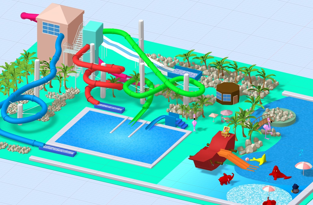
CC – Can you describe the scope and objectives of the WaterWorld?
GM – As Design Lead at Purplesheep, I helped lead the redesign of the Waterworld Bundoran website, focusing on improving user experience, mobile responsiveness, and visual appeal. The goal was to create an engaging, family-friendly interface that clearly communicates attractions, pricing, and visitor information, while aligning with Waterworld’s vibrant brand identity.
CC – What were the main challenges or goals that Waterworld wanted to address through the website redesign and interactive map? GM – The primary goal was to modernise the Waterworld website to better reflect its position as Ireland’s premier indoor aqua adventure park. A key challenge was balancing functionality with fun—creating a site that was both easy to use and visually engaging for families and visitors. Waterworld also wanted a dynamic way to showcase the slides.
Planning and Design Strategy
CC – How did you approach the initial planning for the redesign? What were your key priorities? GM – We started with a deep dive into user behavior and analytics from the old site. From there, we prioritized simplifying navigation, improving mobile responsiveness, and incorporating rich visuals. The interactive 3D map became a standout feature—designed to help users explore the park intuitively before their visit.
Credit Purplesheep.
Creative Ideation & Interactive Elements
CC – What was the creative process behind developing the 3D interactive map and the visual language of the site? GM – The concept was to make the online experience mirror the excitement of visiting Waterworld in person. For the 3D map, we focused on clarity, color-coding, and simple interactivity—allowing users to hover or tap on slides and features for instant information. The rest of the site uses playful, aquatic-inspired visuals and bold typography to capture the park’s vibrant, family-friendly spirit.
Final Execution & Results
CC – What guided your final design choices, and how do you think the redesign improved the user experience? GM – Every design decision was made with the visitor journey in mind—making information easy to find, booking effortless, and the experience immersive. The new site significantly improved engagement metrics, especially time-on-site and conversions. The 3D map, in particular, became a favorite among users and staff, acting as both a planning tool and a visual highlight.